
You're probably planning an all-hands, sales kickoff, leadership retreat, or customer event where one talk has to do more than fill a slot. It has to wake people up, align the room, and give everyone language they'll still repeat next week.
That's where the TED presentation format earns its place in the corporate world.
Most business presentations fail for the same reason. The speaker tries to cover everything. The deck becomes a document, and the audience spends the session reading slides, checking email, and waiting for the one useful takeaway that never quite sticks.
A TED-style approach fixes that. Not because it feels trendy, but because it forces discipline. One clear idea, strong narrative tension, clean visuals, deliberate rehearsal. For executives, founders, technical leaders, and sales leaders, that structure is often more useful than the standard corporate keynote format.
Moving Beyond the Standard Corporate Presentation
A typical corporate keynote starts with market context, moves into priorities, detours into org updates, and ends with a slide full of action items nobody remembers. The speaker may know the material cold, but the audience still leaves without a single sharp message they can carry forward.
The TED presentation format starts from a different question. Not “What do I need to cover?” but “What is the one idea this audience needs to understand, believe, and act on?”
That shift matters in corporate settings because business audiences are overloaded. They don't need more content; they need clear signal.
Why the format works at work
The most useful principle is the time discipline. The TED Talk format uses a strict maximum of 18 minutes to force a speaker to distill one core insight. Moxie Institute notes that this limit helps ensure the central thesis is specific enough to be actionable, broad enough to matter, surprising enough to stick, and important enough to earn the full slot in the first place, as explained in their guide to writing a TED talk.
That's exactly what many corporate talks are missing.
When I coach executives for annual meetings, I usually see the same pattern. Their first draft is accurate and thorough, but unusable on stage. It reads like a memo with transitions. The TED model gives them permission to cut, sharpen, and decide what actually deserves airtime.
Practical rule: If your audience can't state your main point in one sentence after the talk, the presentation had too many points.
What to keep and what to leave behind
Use the TED presentation format when you need a room to feel momentum and clarity. That includes:
- Sales kickoffs: A single strategic message beats a stack of disconnected updates.
- Leadership retreats: A focused talk creates alignment before discussion sessions begin.
- Internal innovation meetings: Teams respond better to one compelling thesis than a laundry list of initiatives.
- Customer conferences: Buyers remember a perspective shift more than feature inventory.
What doesn't work is copying the public TED stage without adapting it to business goals. Corporate audiences still need relevance, utility, and direct application. The story can't float above the work.
If you want a quick primer on the basics behind the format, this overview of what a TED talk is is a helpful starting point. The corporate version just applies those same principles with tighter business intent.
Structuring Your Idea Worth Sharing in 18 Minutes
Most weak business talks don't suffer from a lack of expertise. They suffer from bad sequencing. The speaker opens with background, piles on context, and only reaches the main point near the end.
A strong TED-style structure reverses that. It introduces the core idea early, then earns it.
The structure of a TED talk, broken down
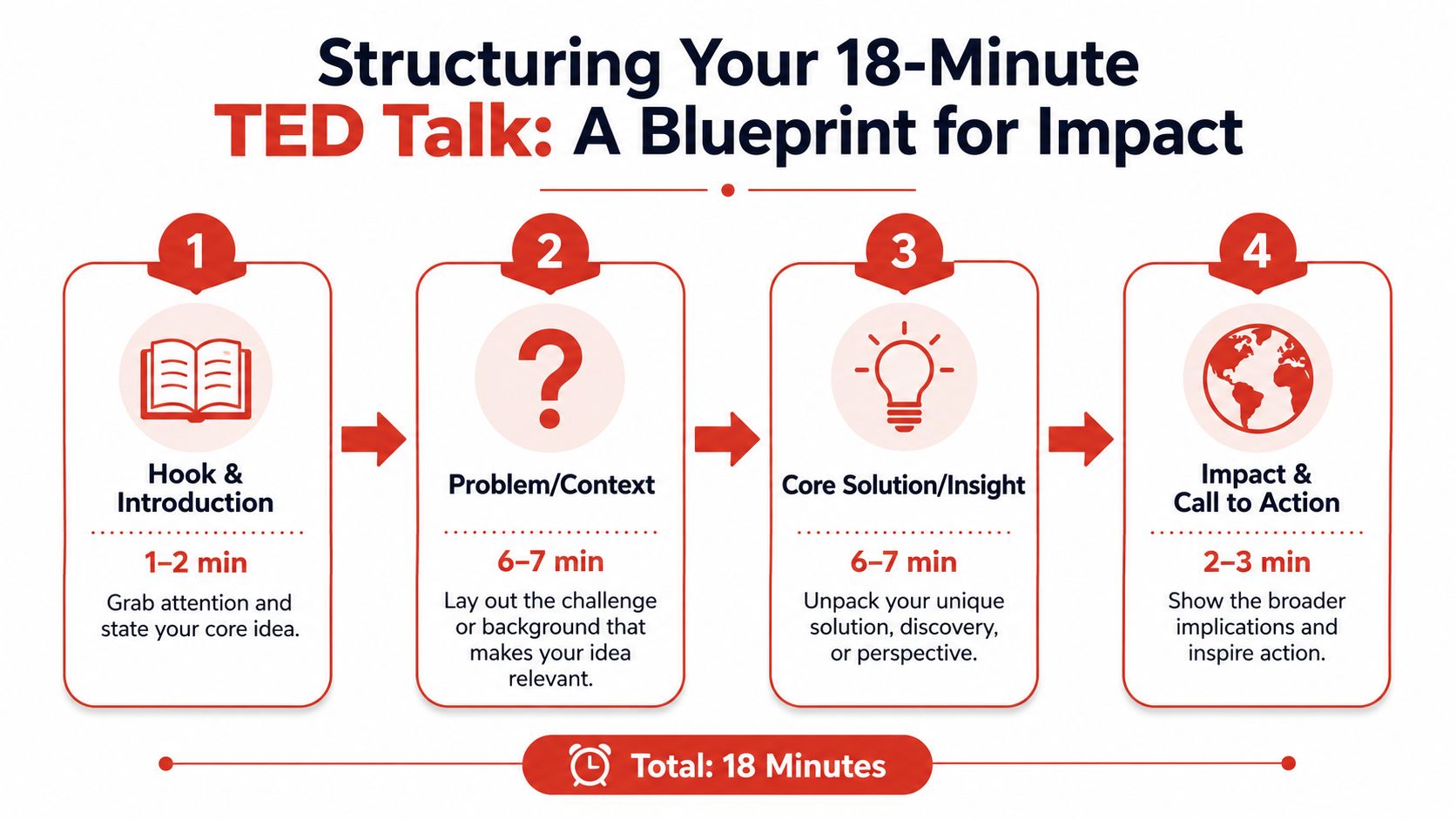
Before you adapt anything, it helps to know what you're adapting. The structure of a TED talk comes down to four moves: open with something that makes the audience care, state the one idea in a single clear sentence, back it up with evidence or a story, then close by showing what changes for the audience once they accept it.
TED also builds in a timing discipline most corporate decks skip entirely. A common breakdown for an 18-minute slot runs roughly three minutes to open, three minutes to introduce the idea, eight minutes to build the case, three minutes to circle back to where you started, and one minute to leave the room with a single line worth remembering. That's the TED talk format in practice, not just as a theory.
Build the talk in three acts
I compress that same four-part structure into three acts that hold up better in a business room:
- Setup
- Conflict
- Resolution
That sounds simple because it is. Simplicity is the point.
The official TEDx speaker guide sets a strict maximum of 18 minutes, recommends rehearsing against timer checkpoints at 6-minute and 12-minute intervals, and often requires speakers adapting a longer deck to cut at least 50% of their slides, as outlined in the TEDx speaker guide. Those constraints make structure essential.
Act one needs to arrive fast
Your opening has one job. It must make the audience care before they start triaging email in their heads.
In a sales kickoff, don't open with territory planning. Open with the shift that changes how the team should think. In a leadership retreat, don't begin with agenda review. Start with the tension the room already feels but hasn't named cleanly.
A useful test is this: if your first two minutes disappeared, would the audience lose anything important? If the answer is no, rewrite the opening.
Try this contrast:
| Weak opening | Strong opening |
|---|---|
| “Today I want to walk through our strategic priorities for the year.” | “We've been rewarding efficiency in a market that now rewards adaptability.” |
| “I'll start with some background on the category.” | “Our customers aren't confused by our product. They're confused by our story.” |
| “Here's the agenda for the session.” | “If this team does one thing differently after today, it should be this.” |
Use conflict to create momentum
The middle is where most talks flatten out. The speaker starts explaining instead of building tension.
Conflict doesn't mean drama for its own sake. In a business setting, conflict is the friction between current reality and desired outcome. It can be a broken process, a market misunderstanding, a product adoption challenge, or a leadership habit that no longer serves the company.
The art of storytelling becomes practical, not decorative. Good narrative design helps the audience follow change, stakes, and consequence. If you want a useful companion resource on that craft, Flexwork Podcast Studios has a solid piece on the art of storytelling.
A technical speaker like Mo Tiwari, an ex-OpenAI researcher who explains frontier AI in plain business terms, can do this well without becoming theatrical. Consider a talk on AI adoption inside an enterprise. The conflict isn't “AI is exciting.” It's “Our company wants speed, but our teams don't trust black-box tools.” That tension gives the talk shape.
Make the resolution feel earned
The final act should resolve the tension with a clear insight, not a pile of recommendations. A speaker like Adam Cheyer, known for helping create Siri, offers a useful model for innovation talks. Complex technology becomes more compelling when framed as a human journey: a stubborn problem, repeated attempts, a breakthrough insight, and the practical implication for the audience.
For internal innovation talks, this structure works especially well:
- Start with the problem people recognize
- Show the hidden assumption that kept teams stuck
- Introduce the new model
- Translate it into one concrete behavior change
For more examples of how innovation themes can be shaped into strong stage narratives, this collection on speeches on innovation is worth reviewing.
A business audience doesn't need every detail. It needs the detail that changes the decision.
Designing Visuals That Amplify Not Distract
The fastest way to kill a TED-style talk in a corporate room is to keep the default company template and shrink a paragraph into every corner of the slide.
That isn't support material — it's stage sabotage.

Slides should play backup, not lead vocals
In the TED presentation format, the audience should listen to the speaker and glance at the screen. In most corporate decks, the opposite happens.
When I review executive slides, I ask one blunt question: if the speaker vanished, would the deck still make sense? If yes, it's probably a document, not a presentation. Stage decks should be incomplete without the speaker.
A better visual standard looks like this:
- One idea per slide: Don't combine headline, framework, chart, and quote on one screen.
- Short text only: Use a phrase, not a paragraph.
- Images with purpose: A visual should deepen the message, not decorate it.
- Data with hierarchy: Show the point first, then the supporting evidence.
Do this, not that
Here's the practical version teams can use during deck reviews:
| Do this | Not that |
|---|---|
| Use a single sentence headline that makes a claim | Use a vague title like “Q3 Update” |
| Highlight one data point visually | Show a full spreadsheet screenshot |
| Use large type that can be read from the back of the room | Shrink text to preserve every bullet |
| Put a clean image behind one strong idea | Add stock imagery that says nothing |
| Reveal complexity verbally | Force the audience to read while listening |
For data-heavy talks, this matters even more. If a product leader has one adoption chart that changes how the audience sees the business, show that chart alone. Strip everything else out. Then narrate what changed, why it matters, and what comes next.
If your team struggles with visual clarity, it helps to think in terms of immediate comprehension. The same principle shows up in adjacent communication work, including Satura AI on clear topic communication. Different medium, same lesson: people decide quickly whether a visual tells them what matters.
Corporate templates are often the problem
Brand consistency matters. But many in-house templates were built for board packets, not live speaking. They include tiny footer text, crowded grids, legal clutter, and low-contrast colors that look acceptable on a laptop and weak on a ballroom screen.
That doesn't mean abandoning brand standards. It means creating an event version of the template.
Design test: Stand six feet back from your screen. If the main idea isn't obvious in a glance, the slide is still doing too much.
Useful slide choices for corporate talks include:
- Strong contrast: Especially important for event screens and remote viewers.
- Readable fonts: Sans serif fonts generally perform better on large displays.
- Simple builds: Clean reveals are better than busy animations.
- Consistent visual logic: If one chart uses color to signal risk, keep that meaning stable throughout the deck.
If you need examples of clearer ways to present metrics and comparisons, this resource on data visualization tools for event professionals is a useful reference point.
Mastering Your Stagecraft and Delivery
A polished script with elegant slides can still fall flat if the speaker delivers it like a compliance update.
Corporate audiences read delivery fast. They know when a leader is speaking to them and when a leader is surviving the slot.

Move with intent
On stage, nervous speakers usually make one of two mistakes. They freeze behind a podium, or they pace without purpose.
Neither works.
Purposeful movement should track the argument. Step forward when making a decisive point. Hold still when sharing something that needs weight. Shift position when transitioning from problem to solution. The movement should serve the audience's attention, not the speaker's adrenaline.
In large corporate rooms, this matters because people at the back need more than audio. They need visible conviction. Front-row executives may catch every nuance. The back half of the room often reads confidence through posture, pace, and presence.
Use voice like a leadership tool
The fastest way to sound less credible is to keep one volume, one speed, and one emotional temperature for the entire talk.
A good corporate speaker varies delivery on purpose:
- Speed up slightly when sharing momentum.
- Slow down for difficult ideas.
- Pause after a line that should land.
- Lower the voice when inviting the room into something more personal.
- Add energy when the audience needs lift, not when the slide says “energy.”
Here's a simple scenario. A CTO at an annual meeting explains why the company must rethink how teams build with AI. Version one sounds technically correct and emotionally flat. Version two adds contrast: a calm setup, a sharper pause before the core tension, then more force behind the new direction. Same content. Different impact.
A short visual lesson on the contrast between static and dynamic delivery can help before rehearsal:
Handle nerves without pretending they aren't there
Even senior leaders get tight before high-stakes talks. The goal isn't to eliminate nerves. It's to convert them into usable focus.
I've seen this play out often in leadership offsites. The speaker feels fine in prep meetings, then steps onto a lit stage in front of peers and starts rushing. Sentences shorten, breath gets shallow, hands become busy.
The fix is practical, not mystical:
- Anchor the first minute: Know exactly how you'll open.
- Rehearse the first transition: Most early stumbles happen moving from opening line to main idea.
- Plant before key points: Don't drift during the sentence that matters most.
- Look at people, not sections: Find one person, complete a thought, then move your gaze.
Don't perform confidence. Build enough preparation that confidence has somewhere real to come from.
For internal events, authenticity beats polish when the two conflict. A leader who speaks plainly, pauses naturally, and connects with the room will outperform someone who sounds over-scripted every time.
The Rehearsal Playbook for a Flawless Talk
The best TED-style business talks feel natural because the preparation was rigorous. The speaker isn't winging it; they have done enough work that the delivery can sound alive.
That's a different standard from memorizing a script.
What effective rehearsal actually looks like
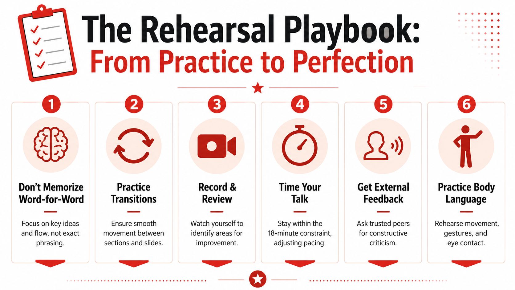
A corporate speaker should move through rehearsal in layers.
Message pass
Start without slides. State the talk out loud in plain language. If the idea sounds muddy without visuals, the structure still needs work.Section pass Rehearse the opening, middle turns, and close as separate units. Here, transitions get fixed.
Slide pass
Add the deck and trim any moment where the speaker starts reading. If the slide steals attention, simplify it.Time pass
Run the full talk and note where pace collapses or sections swell. Most speakers don't have a content problem. They have a timing problem caused by over-explaining the familiar parts.
Internalize, don't recite
Word-for-word memorization usually creates stiff delivery. The speaker sounds fine until one line slips, then everything wobbles.
Internalization is better. Know the sequence of ideas, the purpose of each section, the transition line that moves you forward, and the closing language you want to land cleanly.
That lets the talk breathe while staying controlled.
A useful rehearsal checklist looks like this:
- Mark your turning points: Know where the argument shifts.
- Flag weak verbs and filler: If you keep saying “sort of,” “basically,” or “I think,” clean it up.
- Watch the recording with sound off: You'll notice distracting movement fast.
- Run one rehearsal standing exactly as you'll present: Footwear, clicker, confidence monitor, and stage spacing all affect delivery.
- Get feedback from people who'll be honest: Ask what they remember, where they drifted, and what felt unclear.
Dress rehearsals should feel mildly uncomfortable
If the first full run with lights, slides, and time pressure happens at the event, rehearsal was incomplete.
Do at least one run that feels close to the actual conditions. Use the microphone if possible. Practice with the confidence monitor if there is one. Advance slides by hand. If the talk includes a handoff from an emcee, rehearse that too.
Coach's note: Rehearsal isn't about sounding polished in private. It's about removing avoidable friction before the audience arrives.
That's the difference between a speaker who looks composed on stage and one who looks like they're making edits in real time.
Adapting the Format for Any Corporate Setting
The TED presentation format is a strong core, not a rigid cage. In business settings, you often need to scale it up, break it apart, or rebuild it for a screen.
The smartest way to adapt it is to preserve the single central idea while changing the delivery format around it.
For a longer keynote
A 45-minute executive keynote shouldn't become a bloated version of an 18-minute talk. Keep the TED-style core intact, then add depth in layers.
A useful pattern is:
- Open with the same sharp thesis.
- Spend the next stretch adding context and examples.
- Bring in one or two short audience resets, such as a reflection question or a quick show-of-hands moment.
- End by returning to the original idea in a more applied form.
What fails is expanding by adding more points. Better keynotes don't get wider. They get deeper.
For workshops and offsites
In leadership retreats or internal learning sessions, don't force a full linear talk if the room needs interaction. Instead, use the TED structure as the opening spark.
That can look like this:
| Setting | Best adaptation |
|---|---|
| Leadership retreat | Short keynote, then guided discussion in small groups |
| Sales kickoff breakout | Tight framing talk, then team planning exercise |
| Customer workshop | Insight talk, then live application to the customer's use case |
| Technical offsite | Clear narrative setup, then whiteboard session or demo discussion |
This keeps the emotional clarity of a strong talk while letting the audience do something with it.
For virtual and hybrid audiences
Many speakers fail by copying stage habits that only work in a room. As Maryam Pasha notes in her anatomy of a great talk, virtual engagement can drop 40% when speakers rely only on physical presence without digital interaction layers, and many guides don't give enough detail on practical needs like camera framing and slide contrast for hybrid delivery.
That has direct consequences for annual meetings, offsites, and SKOs with remote attendees.
For hybrid events, adjust the format this way:
- Frame for the camera: Don't let body language happen outside the visible shot.
- Increase contrast on slides: What works on a ballroom screen may disappear on a laptop.
- Add digital interaction moments: Polls, chat prompts, or brief audience response cues help remote viewers stay cognitively present.
- Shorten visual complexity: Remote participants process layered slides more slowly.
- Choose stillness more often: On video, small controlled movement reads better than wide stage motion.
In person, stagecraft can carry part of the experience. On screen, the message, framing, and interaction design have to do more of the work.
A strong corporate speaker doesn't just borrow the TED presentation format. They translate it for the room, the moment, and the audience in front of them.
If you're shaping a keynote, leadership session, sales kickoff, or innovation event and want a speaker who can deliver a clear idea with real authority, Silicon Valley Speakers connects organizations with builders, inventors, and proven voices who know how to move a corporate audience from attention to action.
Related speaker rosters
Browse innovation keynote speakers available for 2026 events.